AI for efficient teaching in special education
For

Project Context:
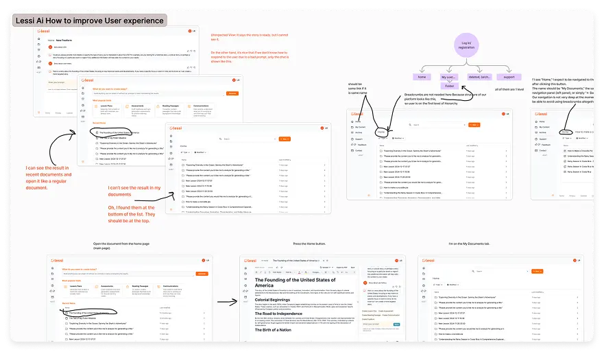
Lessi.ai is an AI platform designed to support special education teachers in creating personalized learning materials.
Platform’s goal is to reduce teachers' workload, allowing them to spend more time on direct instruction and interacting with students.
Platform’s goal is to reduce teachers' workload, allowing them to spend more time on direct instruction and interacting with students.